
Insignia Designs: Signs of Visual Impact
Quote my Project!It’s not easy being ‘seen’- particularly when there are signs everywhere- of every size, every shape, and every color…To give your sign the best chance of standing out in a sea of signage, whether we’re talking vehicle wraps, monument signs, tradeshow booths or exterior window messages, consider just two things:
Simplicity and Space
When we’re talking Simplicity, less is really best. On a vehicle wrap, you’re visible everywhere- even on the highway where possible clients are zooming past at 65 mph. How much time to do they have to get your message? Not a lot. Keeping your message simple and easy to read helps them remember: maybe just use your company name, website/ phone number, prominent logos, and contrasting colors.
The same applies to window graphics and trade show signs. You could list everything you do, but why? It’s too much for potential customers and gives them no reason to approach you to ask questions – or open your front door. And if they’re in a hurry, they’re in no frame of mind to read it all. Pique their curiosity by using your name, type of business and maybe just a few bullet points- give them a reason to ask you more
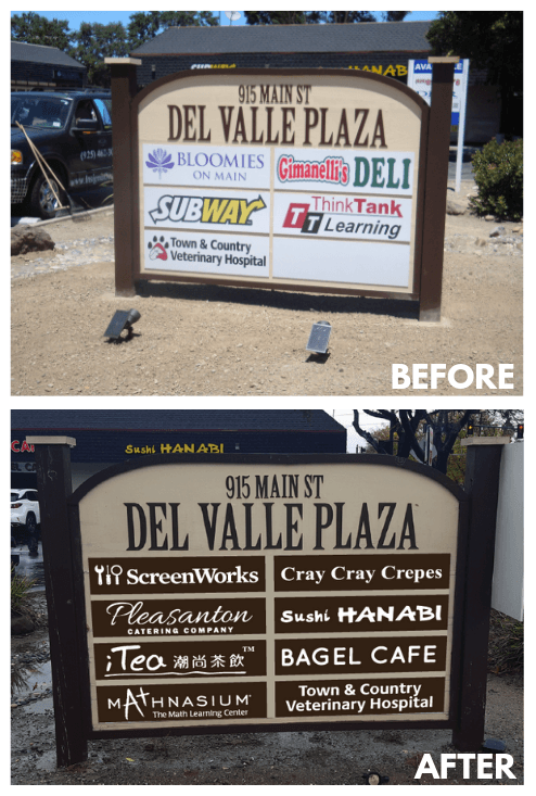
When we’re talking Space, it’s all about keeping it clean and easy to read. Monument signs on buildings with multiple tenants are a real challenge- particularly when there’s no sign program in place. You may be staring at the monument sign where you’re about to open your business and find you’ll be the newest in a collection of 10-20 businesses. And even though each sign has the same dimension, each sign also has different fonts, logos, colors. You’re wondering- how will customers easily find me?
One key is by designing space into your sign in a contemporary manner. Evaluate the existing signs and their color schemes- if they are older signs, you will probably see swirly fonts, wordiness, multiple colors, and very little clean space around the business name.
Then consider the following elements when designing your sign: your logo or business name; using only two colors- a light one and contrasting dark; and using space as a border around the name and lettering in a bold, clean font so it “pops.”
Check out the monument sign Insignia Designs created for Del Valle below using these ideas and let us know if we can help your signs stand out in 2019!
#monumentsigns #simplicity #space #smallbusiness #businessowner #pleasanton #insigniadesigns #signs #signbusiness #trivalley #familybusiness #customerservice #newbusiness #branding #tradeshows #vehiclewraps #windowsigns