Insignia Designs: Getting it Right from the Start
Quote my Project! At Insignia Designs, we know there’s more to a sign than meets the eye- literally – and our first sign meeting can either propel the project forward, or stop it in its tracks.
That’s why beforehand I spend time learning about your company, checking the website for design themes, researching the building’s signage requirements and aesthetic, and reviewing city codes.
As a client, you can also help our meeting go from GOOD to GREAT by following the
“5 Ls” ahead of time:
#1 LIMITATIONS: If your company is a franchise, wholly-owned subsidiary, or satellite office, corporate branding requirements will dictate design restrictions and opportunities. Providing me with this information saves us both time and streamlines the process. These requirements may or may not include the items listed below, as well as details such as finish, size and thickness for interior, exterior, free-standing, mounted and fleet messaging.
#2 LOGO: Your logo is your visual identity so in order to reproduce it accurately, I need three things:
1) Provide a vector file of your logo. Usually this is the version designed by a graphic designer in Adobe Illustrator or as an .eps file. If you have a photo in your logo, it should be a high-resolution shot at 300 dpi. While low resolution jpegs or .png files look “okay” printed out for business cards or collateral, providing your vector file will avoid pixilation and ensure clarity for signage as we adapt it to different materials.
2) Branding or Style Guides
a. Fonts: Descriptions and Sizes. Even if we reproduce your logo in a different size, we need to know the ratio of elements as they relate to each other- particularly when multiple elements are involved.
b. Colors: Official Pantone Color Numbers- exact match is key when you’re working with different materials and sizes. If you aren’t certain, ask your graphic designer, print company or the corporate entity where the design originated.
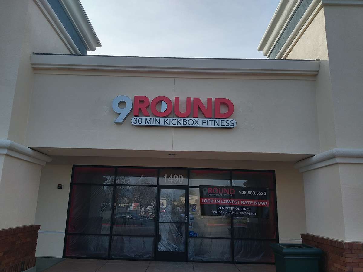 #3 LOCATION(S): Think about Exterior Sign Placement: The setting for your sign is just as important as the sign itself. Will it be set against a clear window or opaque wall? Will it be wrapped around a car, affixed to a hanging canopy, or free standing in a bed of foliage? Will the material used be smooth or rough? Painted or tinted? Light or dark? Identify foot and car traffic patterns – can prospective clients find you?
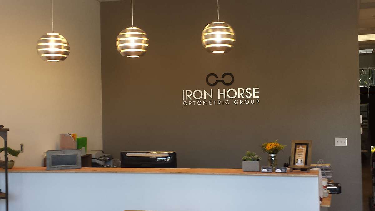
The same consideration goes for Interior Signs, in particular against the walls and backgrounds- particularly with the trend for light colored and glass walls to promote well-lit environments. We use detail work in these conditions – for instance, to prevent silver metallic signs from receding into white walls, the sides of a 3D sign can be fabricated with a contrasting color, or the wall’s color deepened one or two tones.
#4 LIGHTING: Whether inside or outside, you want your sign to stand out in the best possible light- literally!
For exterior lighting, check the exposure of your surroundings at different times of the day before we meet. How light changes can impact what people see. Where do you have natural, fluorescent or incandescent light? What direction does your entry face? Will the sign need to be self-illuminating or is there existing lighting?
Just as important is how shade areas impact visuals. Based on the movement of the sun, a sign will fall into the shadows and if you have a dark logo or sign against a dark building, it’s difficult to read.
Interior lighting can also impact the visual display of a sign. We work with electrical companies to adjust lighting schemes accordingly. Our goal is for your sign to be visible no matter the conditions or time of day.
#5- LIST IT!
Finally, compile all this information in a punch list so we can review it together as we walk the site. Signs are our business – it’s what we do day in and day out. With just a little preparation, your vision for a new sign may be just one meeting away!